Posts Tagged ‘Concept Art’
Clouds Port
13th Dec 2023
0
I made Clouds Port a while ago but as usual I forgot to post it.
Basically I was looking for the best way to create believable clouds in Blender for something completely unrelated, and I came across the awesome CloudScapes addon.
So, this is an obvious attempt at messing around with volumetric clouds. Did I overdo it? Maybe! But I have a thing for clouds, I like to draw them, paint them, take pictures of them and now generate them in a 3D scene.
I then just hastily put together a very cheap couple space station just to avoid having a picture just of clouds.

Clouds Port
As all this work I’m doing in Blender is pretty much a way to learn something new every time, along the way I learned how to better manage volume shaders in Blender, which is something I hadn’t spent much time on before.
The one thing I’ve learned about Blender is that it’s the deepest rabbit hole I could ever have dived into.
You learn one new thing and another three pop up that you had never thought about.
As for the rest, the greebles and paneling are just displacement maps made with SciFi FLEX, and since the scene ended up being super low poly I put together a short animation because why not:)
For the 2D image I did very minimal editing. Mostly the lights from the ships’ engines, as I really didn’t have the time to do those in Blender.
I know, it’s just 5 seconds, but apparently that’s the attention span of the average Internet user.
by Paolo Puggioni
Circle Ward 27
24th Nov 2023
0
I made Circle Ward 27 as part of my ongoing learning process in Blender.
I have reached a level where I actually find it faster to mock up a scene in 3D than draw everything from scratch, which is a good boost to my workflow.
I have always used 3D as a block out for big environments even in studio, but I always relied on 2D for the final result.
Being more confident with Blender means unlocking a whole lot of subjects I hadn’t bothered with so far.
For example, drawing the aerial view of a big city like this in 2D would mean days of painstaking work, unless one doesn’t resort to completely different workflows like photobashing and matte painting, or goes for a much, much less polished and more “impressionistic” work with just brushes and patience.

I resorted to a couple of awesome add-ons for Circle Ward 27.
The main one was the great BlOSM (Blender Open Source Maps), which allows you to pull any city in the world from the OSM database and import it into Blender.
Well, at least a small parts of them, if you don’t want your graphic card to blow up.
The learning part here was about texturing each building, for which I did a “meh” job to be honest.
Next time I’ll use displacement maps to make them look less flat, and maybe add some reflections and specularity to the windows.
I wasn’t going for a production-level of quality here, so that’s good enough for now.
The second add-on that I’m really getting fond of is SciFi-FLEX, which cuts down by A LOT the tedious and repetitive process of creating and scattering panels and greebles.
I also did a mediocre work here. By the time of writing I got a lot more competent with it, and next time around I’ll use displacement maps instead of the hundred thousands polys I scattered around here.
I still did quite a bit of overpaint and editing in 2D using my trusted Krita, I don’t think I’ll ever turn into a 3D artist any time soon.
I’m basically a Concept Artist who happens to use 3D.
Anyway, I’m having huge fun working with Blender.
This was done in my spare time while learning new features (to me). For my freelance work I’m already completing a huge scene for a Star Trek illustration that it would have literally taken weeks if done in 2D from scratch.
As it happens in publishing I won’t be able to post that for months, so you’ll have to trust me on that for now:)
by Paolo Puggioni
John Carter of Mars – Red City
16th Jan 2018
0
Following my last post, Red City is the second illustration I made for Modiphius Entertainment’s John Carter of Mars RPG.
Now, saying that my memory is bad is, in general, a gross understatement.
I’m talking about long term and short term here.
If you add to that the fact that I read John Carter of Mars about 35 years ago, it’s like I actually never read it. I still have blurred memories of white apes and John carter jumping around a lot, but sadly nothing about red cities.
I’m not saying that this is intrinsecally bad. I mean, you wake up and everything is kind of new, yay. And you can play the Witcher 3 for the third time and still find it full of pleasant surprises.
Having a crap memory doesn’t help, however, when it comes to illustrating a five books series you haven’t had the time to finish re-reading yet.
So, all the information I was working on here was from the brief I got for the illustration; if anyone finds some awful inconsistency please let me know, although I’m pretty sure the art directors would have spotted it.

Since drawing a city of this complexity from scratch is pretty time consuming, especially when you make changes to lighting or point of view further down the line, I made a quick 3D model of the layout on Sketchup and then painted over it.
I saved about a dozen views of the whole scene and submitted about half of them.
Of the sketches below, the first one is the one that was picked.


That’s it for John Carter of Mars I think. I have a bunch of concepts sitting in my hard drive but I’m not sure I can post them.
by Paolo Puggioni
Cold Engines
9th May 2017
0
Cold Engines is part of a set of illustrations I made for Horizon Games back in March.The game is called Traveller, and after a successful Kickstarter campaign it’s estimated to be delivered in July 2017.
Working on the project has been huge fun, although, as it always happens, when I get commissions I get them all at the same time (most of which I won’t be able to share for a long time), and I now remember March as a blur of drawings, concepts, and nights spent on my Cintiq working while Watching Netflix on my secondary monitor.
Still, as I said, I had great fun with this, and the people I worked with were great.

I’m quite happy about this illustration in particular, as I had never drawn an Asian face before, oddly enough, and I think it ended up being not so bad.
I also think the perspective and the lines of the cockpit worked nicely together, so all in all this time I’m not complaining about the result when I look at it a month after it has been completed.
(Note to self, those kind of reds DO NOT translate well in CMYK!).
Only bump along the road was about me being a dumb idiot, and delivering the illustration with a screen reading ENGINE NON-REPONSIVE.
I still don’t know how I managed to mess that up.
Oh well.
Anyway, there are a few more illustrations I made for the project, which I’ll post in the coming days.
by Paolo Puggioni
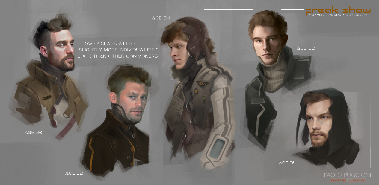
Freak Show – Chayne
14th Feb 2017
0
Chayne is the only pure human among the main characters of Freak Show.He is an activist who fights for trans-humans’ rights, so for a time I had considered making him like some stereotipical, cartoony “I go to all the protests and I don’t eat food which had a face” kind of person.
Then I decided against it.
This is the first page I made, a while ago.
I had no strong feelings towards any of them, so John picked up the youngest one.
I think his genuine look is fitting for an idealist, and I’m quite happy with the veil of innocence and ingenuity in his face.
Once we agreed on a general look, I made some full figure studies.
His clothes are consistent with the look I devised for the generic population, with the only difference that Chayne wouldn’t wear any head gear.
In purists worlds people would normally cover their head as a sign of modesty, and as a rebel I figure Chayne would not want to conform to that idea.
Also, I have to confess that I didn’t fancy one of the main characters to be wearing a hat that would make him look like the modern equivalent of a medieval farmer.
Anyway, here are some studies for Chayne.

We picked the first from the left, but don’t mind his face.
I made a few more experiments on this round of sketches, but his official look is still that of the young guy from page one.
Now I’m *this close* (makes gesture with thumb and index drawing close) to starting with the panels.
I just need to finalize a secondary character and some security guards, then I’m ready to go.
So you’ll be seeing a few more concepts over the next days.
by Paolo Puggioni
Freak Show – Thrannak #2
2nd Feb 2017
0
Here some more concepts for Thrannak, another one of the main characters in Freak Show.
Thrannak is a trans-human, and as opposed to Zaquida, she comes from a trans-humanist planet.
I haven’t designed anything of the visual style of the trans-human society yet, but I know that, where Purists are severe, modest and sober, trans-humans would make a point of affirming their own individuality, so I’d expect a more eclectic visual language.
For the Purusts I used mostly straight lines, sharp angles and dark and desaturated colours, so it makes sense that, by contrast, trans-humans’ aesthetic will be more organic and based on elegant curves.
We won’t show trans-humans environments until later on in the story, so I think this is enough for now.

As far as Thrannak goes, some elements of her home world is already hinted at in her outlook.
First of all, she is obviously a “modified human”. The scars (or seams) on her body serve as some sort of “war paint”, as well as having the function of hiding all the gear implanted under her skin.
Contrarily to Purists, who seldom indulge in frivolities, she is wearing piercings and an extravagant hairdo.
Also, well, her skin is green.
I meant her to have a very masculine build, and I think that is already working.
I did take some male body builders as a reference, and changed a bit hip size, lats and neck.
In the first version she also had some marks on her face, but John rightly pointed out that it could be confusing when next to Zaquida, so I removed them in this iteration.
With this I’m getting close to having enough material to start working on the panels.
Some of it is already done, just waiting to be posted here.
Just some polishing on a space ship, a couple of characters and we’re good to go.
by Paolo Puggioni
Freakshow – Thrannak Concepts
17th Jan 2017
0
Second main characters of our comic Freak Show, Thrannak will be the one to take care of things when the situation requires physical strenght.
As opposed to Zaquida, Thrannak comes from one of the Transhumanist worlds, and all her augmentations have been designed to make her more effective in combat.

As you can see, all her augmentations are installed under her skin, and are developed when needed.
Initially I had thought the seams should be as inconspicuous as possible when the weapons are hidden.
Then we decided she would look thougher with lines running on her body in intricate patterns, like a Maori warrior or something like that, so I’ll make another version to see how she looks like.
John and I haven’t really decided yet if the communication devices implanted in Thrannak’s skull should be more or less visible.
In the concept I made them hidden under her scalp, whereas John would like them to bulge a bit more.
I’ll have to look into that too, although I have to confess that at least in “rest mode” I’d be happier for them to look more like scars.
I have to point out that these concepts are just meant to be a study of how Thrannak would look like in general, all the clothes she is wearing right now are just to avoid drawing her naked:)
I’m going to make a set of concepts to design the clothes she’ll be waering when fighting in the Freak Show, and then more sets with maybe a combat suit, generic overalls and so on.
I really dislike the “super hero costume” kind of idea, so I’d like to change her attire as often as possible as the comic develops, and instead use other elements to make her more iconic and recognizable.
Next bunch of Freak Show concepts coming up soon.
by Paolo Puggioni
Freak Show, a New Comic
12th Jan 2017
2
I am very, very happy to announce that John Ayliff and I have started working on Freak Show, our very own comic.
John is the author of Belt Three, published by Harper Collins.
Before he became a full time writer, John and I used to work together at Jagex, where I was Lead Concept Artist and he was Senior Game Developer, one of the guys who wrote the storylines of our Runescape quests.
His story lines were always a pleasure to read. Deep, unpredictable, imaginative, exciting.
Every time I was told I was to start working on one of his Runescape quests I thought “oh, this is going to be good”, and I was never wrong.
My respect for his work is what prompted me to get in touch with him a few months ago to propose a collaboration on a comic.
I always wanted to try my hand at working on something as challenging as a comic book, but for one reason or another I never thought I was ready for it.
For an artist, it’s like the end-of-level boss, the Emperor Palpatine of our craft.
It requires complete mastery of perspective, composition, visual storytelling, anatomy, character design, plus a dozen other things I can’t even think of right now.
At the same time it’s a huge endeavour, it requires planning and perseverance.
A few months ago – I can’t remember what triggered the thought – it suddenly dawned on me:
“Hey, maybe now I can sort of do that”.
“Oh, and that”.
“Ah I can also handle that bit if I try hard enough!”
So, although I still had some doubts about my ability to do everything to professional standards (I’m not a professional comic artist yet!), I got in touch with a professional writer – John – who was happily willing to work on this together.
After a few months of email exchanges we came up with a plan, a name and a synopsis.
I obviously can’t share too many details about Freak Show yet, mostly because it’s still in its early stages and many things might still change.
Freak Show is set a few centuries in the future, where a social struggle is ongoing between “altered” humans (called Transhumans, those who enhanced their body through technological or genetic means) and “pure humans”.
On some of the planets Pure humans are predominant, so Transhumans are regarded as Freaks, held captive, and displayed in road shows, even forced to fight against each other.
The story focuses on a small group of characters, and how their story develops within one of these freak shows.
The concept below is the first design I made for one of the main characters.

Her name is Zaquida, and her particular augmentation allows her to interface with computers of any kind and gain control over them.
I explored different ages, and eventually we went for the third from the left, the 20-year-old.
My favourite was the 14-year-old, but the story needed a slightly older character.
For the next couple of months I’ll be concepting every bit I need for the first few pages of the comic: generic characters, spaceships, props, main characters, buildings and so on.
So you’ll see more of this in the near future.
by Paolo Puggioni
Golden Tooth
1st Dec 2016
0
Golden Tooth is the first illustration I made for Lions of Casterly Rock, the latest Game of Thrones game expansion by Fantasy Flight Games.
As I said in my previous post, the card is featured together with Lannisport Treasury on the product page, which, random an event as it may be, is still a small satisfaction:)
As it always happens, the expansion has seen its release quite a long time after the art had been produced for it, as – if I remember correctly – I worked on it almost exactly a year ago.
This was also the very first professional illustration I made with Krita, and I have to admit I was quite nervous about it.
Most of the workflow with Krita is no different to that of many other drawing programs, but still, most of one’s productivity relies on muscle memory, and using new tools and brushes when you are on a deadline tends to make you feel dizzy.
The fact that everything went smooth is what eventually convinced me to stick with Linux in general, and Krita in particular.
What really made me think “ok I’m sold”, however, was the natural feel of the sketch brushes.
The one I used for Golden Tooth has evolved a bit since this sketch was made.
Still, the feeling was already pretty close to that of an actual 5B pencil.

The real struggle started with the rendering.
Getting things to a state I was happy with did take some learning.

My usual procedure would normally imply dropping colours on the canvas very loosely, then using a series of mixing brushes to blend them together and drawing finer details in when needed, close to what you would do with wet-on-wet with oils or acrylics.
The mixing brushes that ship with Krita weren’t quite exactly what I needed, so I did spend some time to create my own.
You can see some of the blending brushwork in these spot.

Another hurdle was making custom brushes for the grass on the hills and the stones of the castle walls.
Still, somehow I managed.

These were admittedly a bit primitive, the ones I’m using now are a lot better, I’ll share them when I can.
Apparently there’s a bug in Krita that prevents bundles from including brush tips, so I have to look into that before I can share my own.
I’ll post the other cards I made for Lions of Casterly Rock next time.
by Paolo Puggioni
Black Angel
22nd Nov 2016
1
During the past few weeks I’ve been hugely, frantically busy.That must be why I haven’t posted anything in a while.
There are indeed quite a few projects I’m working on, some of which I’ll be sharing over the next days.
All in all I am *this close* (rises his hand to show his thumb and point finger getting close) to actually having too much on my plate.
Because of that, the other day I fell victim to a case of Spring Cleaning Disease.
That’s when you start throwing away a bunch of crumpled paper because you want to tidy up just a little bit, and before you know it you are crouched under your desk scraping dirt off skirting boards with an old tooth brush.
And it’s not even Spring.
It might be because when I’m so swamped I need order, and a schedule, and a list of things neatly arranged one after the other, else I go crazy.
Whatever the reason, I started by removing some clutter from my second desk (the one where I dump the pointless crap, the unread post, pencil shavings, dirty mugs and so on. Oh and my easel).
Then I finally ordered the art books in my shelf by size and topic. I’ve been wanting to do that for months.
Then I assembled the dashcam I bought like 6 months ago and never got the time to get into my car.
After that I started to archive and back up the finished work (I do redundant backups because better safe than sorry), and since everything was safe I thought “fuck it, let’s do it now”, and installed the new Opensuse Leap 42.2.
Which is awesome, by the way.
Getting Krita and all of my documents back on my fresh install, I came across an old anatomy exercise that had been knocking around my hard drive for several months, and sice it added to my list of uncompleted tasks (and thus to my mental chaos), I decided to finish it before I committed to anything else.
So there she is, my Black Angel.
As many times before, it had started as a lazy evening practice and it became something else.

Once this was done, I finally put together my nice list of tasks, and on an empty, zen-like white desk I was finally ready to go ahead.
I’ll post some more stuff later this week.
by Paolo Puggioni
- Copyright © 2016 Paolo Puggioni. All rights reserved | Privacy policy / Cookie policy | RSS Feed - Subscribe!
